The Recommendations page provides multiple charts and a table displaying AIM’s optimized budget allocation over time, broken down by channel or partner. It illustrates how your spend will shift based on your selected optimization strategy.
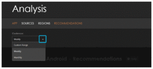
Cadence
You can view your data in specific segments of time using the cadence or Date range tools.
The Cadence tool is located at the top right of the dashboard. Choose from the following options:
Options:
- Custom Range
- Weekly
- Monthly
Recommendations Spend Chart
The Recommendations Spend Chart displays the channel’s spend over the selected cadence. The chart displays the previous two cadences (weeks or months). A vertical line shows the current day allowing easy identification of the past actual spend and the future recommended spend.
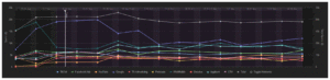
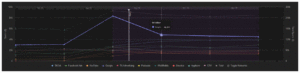
Each source appears at the bottom of the line chart with a unique color. Clicking on a source will enable or disable the source on the chart. A gray line shows the total spend.
Hover over the chart to view detailed data.
Predicted BAU vs Recommended Bar Chart
The Predicted BAU vs Recommended bar chart compares the sources spend next to the AIM recommended spend.
The chart displays data based on the selected cadence. Hovering over the chart will display the associated data.
Click Predicted BAU or Recommended to show or hide that data series on the chart.
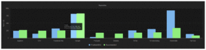
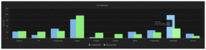
The side-by-side comparison between the predicted BAU and recommended spend helps you quickly notice AIM’s recommended shifts in spending.
If the green bar is higher than the blue bar, the channel should receive more budget than BAU predicts. If the blue bar is higher than the green bar, the channel should receive less budget than BAU predicts.
Recommendations Table
The Recommendations Table displays network metrics split by Predicted BAU and AIM Recommended metric value. This table provides a detailed view of AIM’s recommendations for the period you select (day, week, or month) in the Spend Line Chart above.
Click column headers to sort networks in ascending or descending order. Use the page settings tool to add or remove metrics. The Recommendations Table displays up to ten metrics.
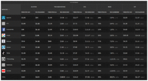
The ± values (grey numbers) represent the model’s confidence interval for the recommendation. Smaller ± ranges indicate higher confidence in the prediction, while larger ranges show greater variability and uncertainty.
This table is valuable to validate the specifics of AIM’s recommendations at the channel level. The BAU vs. Recommended for both spend and outcomes can be easily compared.
When recommended spend increases and the corresponding CPA decreases, AIM identifies this as an opportunity to scale efficiently.
When recommended spend is lower while predicted FTCs or installs remain strong, AIM indicates that the channel may be overspending under BAU conditions.
Click the download icon to download the table data. The system downloads a CSV file with the data.