The Analysis App page lets you view multiple metrics for the selected app.
The page is divided into three sections the Top-line Metric, Headline Metric and Chart Metric sections.
The AIM app analysis page provides flexibility within each of the page sections to display the metrics that are most relevant to you.
The Influences chart displays an interactive view of goals over the selected time-frame with the option of breaking down the selected goal by networks.
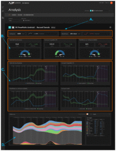
A. Top-line Metrics
B. Headline Metrics
C. Chart Metrics
D. Influences
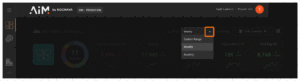
Cadence and Date Range
You can view your data in specific segments of time using the cadence or Date range tools.
The Cadence tool is located at the top right of the dashboard. The following options are available:
Options:
- Custom Range (default shows 31 days)
- Weekly (default shows 12 weeks)
- Monthly (default shows 12 months)
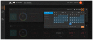
The Date range tool provides the ability to select from predefined date ranges or selecting a custom date range. The following options are available:
Options:
- Last 12 Weeks
- Last 8 Weeks
- Last 4 Weeks
- Last 12 Months
- Last 9 Months
- Last 6 Months
- Custom Range
The Cadence and Date Range tools provide you the flexibility to zoom in on short-term tactical changes or zoom out to understand longer-term trends.
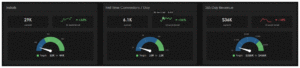
Top-line Metrics
The Top-line Metrics section provides the ability to select the two most important metric that you would like to display. These metrics should be the two core financial or volume indicators.
Each top-line metric displays a title, current spend and a trend based upon the cadence and date range selected.
The trend provides an interactive line graph allowing you to hover over any point on the graph and view the date and spend.
When a metric is displayed in white, this indicates a metric that is not advised by AIM (i.e., Ad Spend).
When a metric is displayed in green, this indicates that the metric is trending in the correct direction.
When a metric is displayed in red, this indicates that the metric is trending in the incorrect direction.
The following metric options are available for the Top-line Metrics section:
Options:
- Ad Spend
- Break Even
- Installs
- First Time Conversions 7 Day
- 365 Day Revenue
- Cost per Acquisition 7D
- Paid Return on Ad Spend (365D)
- Total Return on Ad Spend (365D)
- Payments 7 Day
- Revenue 7 Day
- Paid Installs
- Paid First Time Conversions 7 Day
- Paid Revenue 7 Day
- Total Cost per Install
- Cost per Install
- Install to FTC Conversion Rate
- Revenue Activity
- Paid Revenue Activity
- First Time Conversion Activity
- Paid First Time Conversion Activity
- Payments Activity
- Paid Payments Activity
- Organic Payments Activity
- Registration Activity
- Paid Registrations
- Paid Registration Activity
- 7 Day Registrations
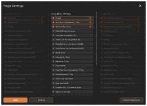
Headline Metrics
The Headline Metrics section provides the ability to select three metrics to display.
Each metric that is displayed as a headline will show the metric title, the current (spend or metric percentage), the trend and a gauge illustrating the target and where the current standing is compared to that target.
The blue section of the gauge represents the business-as-usual range (current trajectory without optimization).
The green section of the gauge represents the potential outcome if AIM’s optimization strategies are applied.
The trend line provides the historical performance for the KPI across the chosen date range and cadence.
Targets are setup by the AIM model as an achievable goal that could be aimed for in the selected metric.
The following metric options are available for the Headline Metrics section:
Options:
- Paid 365 Day Revenue
- Cost per Acquisition 7D
- Paid Return on Ad Spend (365D)
- Installs
- First Time Conversions 7 Day
- 365 Day Revenue
- Total Cost Per Acquisition 7D
- Break Even
- Payments 7 Day
- Revenue 7 Day
- Paid INstalls
- Paid First Time Conversions 7 Day
- Paid Revenue 7 Day
- Total Cost per install
- Cost Per Install
- Install to FTC Conversion Rate
- Revenue Activity
- Paid Revenue Activity
- First Time Conversion Activity
- Paid First Time Conversion Activity
- Payments Activity
- Paid Payments Activity
- Organic Payments Activity
- Organic Payments Activity
- Paid Registrations
- Paid Registration Activity
- 7 Day Registrations
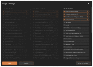
Chart Metrics
The Chart Metrics section provides the ability to select four metrics to display in an interactive chart form. The charts display AIM’s predictive models for any metric or KPI selected.
Each chart displays the selected cadence and date range. Hovering over any part of the chart will display the associated data.
A vertical line shows the current day. Chart data to the left of the today indication represented by a solid line is data from the past and is validated. Chart data to the right of the today indication represented by a dotted line is data that is projected and may reflect differently once the data has been validated.
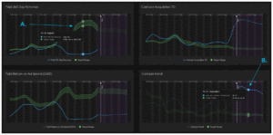
A. Validated past data
B. Projected future data
The blue line represents the business-as-usual trajectory (continuing current spend and strategy).
The green target range represents the optimized scenario or what could happen if AIM’s optimization strategy is applied.
Each chart has a blue line which represents the selected metric and a green line which represents the target range.
Influences Chart
The Influences Chart is an interactive chart that displays the natural demand, networks, rating effect and holiday effect.
The Influences chart shows the key factors affecting your results. It highlights how different channels, campaigns, and external conditions contribute to your selected KPIs, helping you understand what drives performance.
You can break down the data by network enabling flexibility and clarity in viewing your data.
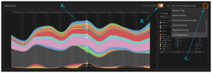
A. Hover over chart
B. Breakdown chart by network
C. Goal selection
The Influences Chart also provides the option of displaying different goals. The following goal options are available for the Influences Chart:
Options:
- Installs
- First Time Conversions 7 Day
- 365 Day Revenue
- Payments 7 Day
- Revenue 7 Day
- Revenue Activity
- First Time Conversion Activity
- Payments Activity
- Registration Activity
- 7 Day Registrations
The Influences chart is a key tool for incrementality analysis. It reveals the true sources of your results by distinguishing paid contributions from organic demand and external factors. This insight helps you allocate budget more effectively and understand the drivers behind your ROI.