The Sources page shows how each media partner and external factor contributed to your KPIs. Use this page to compare source performance and identify optimization opportunities.
The compare tool allows you to easily pin either a source or an advertising method such as email or SMS to the top of the table.
Region, Cadence and Date Range
You can view your data in specific region or segments of time using the Region, Cadence and Date range tools.
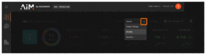
The Region tool provides the ability to focus on specific regions around the world.
The Cadence tool is located at the top right of the dashboard. The following options are available:
Options:
- Custom Range
- Weekly
- Monthly
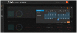
The Date range tool provides the ability to select from predefined date ranges or selecting a custom date range. The following options are available:
Options:
- Last 12 Weeks
- Last 8 Weeks
- Last 4 Weeks
- Last 12 Months
- Last 9 Months
- Last 6 Months
- Custom Range
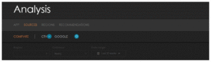
Compare Tool
Pin important networks or advertising methods to the top of the table for easy comparison.
Click ‘+‘ to add selections or ‘X‘ to remove them.
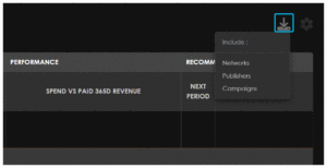
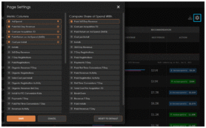
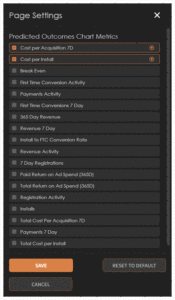
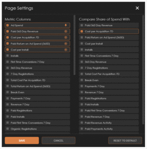
Page Settings and Download Tool
The Page Settings tool provides the ability to select which metrics columns are displayed as well as which metric is compared to the Share of Spend.
The download tool provides the ability to download the current table and data in a CSV file format.
Click the download icon and select from the following:
Options:
- Networks
- Publishers
- Campaigns
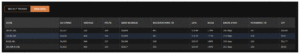
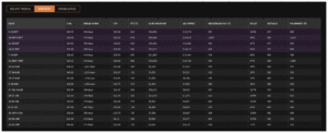
Sources Table
The Sources Table is divided into three main sections Metrics, Performance and Recommendations. Hover over graphs in table cells to view detailed data.
The table header provides grand totals of the selected metrics as Blended KPIs. Click column headers to sort table data either in ascending or descending order.
The Metrics Section of the table comprises the largest section of the table. Each KPI or metric will display a trendline which represents the historical trajectory of that metric over the chosen date range and cadence. Hovering over any of the trendlines within the display the corresponding data.
All values in the metrics columns represent incremental measurements, showing the true causal impact of each channel, campaign, or factor.
The Performance Section provides a visual comparison of each partner’s share of spend versus their share of contribution to the KPI or metric you select. The blue bar represents the partner’s share of spend. The purple bar represents the partner’s share of contribution for the selected KPI.
The performance visualization provides the ability to quickly notice imbalances between investment and results. Balanced bars (blue ≈ purple) suggests a partner is contributing in-line with spend. If blue bar is much larger than the purple bar, this indicates overspending relative to performance (potential pull back). If the purple bar is much larger then the blue bar, this suggests a channel is providing more value than anticipated (potential to scale up).
Under the Recommendation Section, a cell provides AIM’s recommendations on how to adjust spend for each partner in the upcoming period, tailored to your selected cadence and optimization strategy. The recommendation cells provides first-glance optimization view, giving quick directional guidance. These cells also provide insights into which channels are expected to scale up, hold steady, or reduce in the immediate future.
Clicking on a source will place that source into the compare feature and open a page where you can view the source as a network, a publisher and any campaigns that have been run using that source.
Network:
Recent Trends —
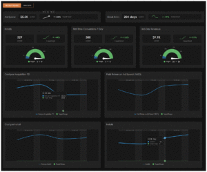
The Network Recent Trends page provides insights into recent spend and how that spend has influenced acquisition, conversions and installs. The page is divided into three sections the Top-line Metrics, Headline Metrics and Chart Metrics.
The Top-Line Metrics section provides the ability to view two metrics which will display the current value as well as the trend based on the selected cadence and date range. Hovering over the line chart will display the associated data.
The Headline Metrics section provides the ability to select three metrics to display. Each metric that is displayed as a headline will show the metric title, the current (spend or metric percentage), the trend and a gauge illustrating the target and where the current standing is compared to that target.
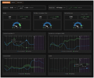
The Chart Metrics section provides the ability to select as many metrics to display in an interactive chart form as needed. Each chart displays the selected cadence and date range. Hovering over any part of the chart will display the associated data.
A vertical indication is displayed for the current day. Chart data to the left of the today indication represented by a solid line is data from the past and is validated. Chart data to the right of the today indication represented by a dotted line is data that is projected and may reflect differently once the data has been validated.
Each chart has a blue line which represents the selected metric and a green line which represents the target range.
Raw Data —
The Network Raw Data table provides the ability to examine your data in row level form. Using the page settings tool allows you to determine which columns are displayed.
Forward looking data is highlighted in purple. This data represents the next period (i.e., Next 4 Weeks) in accordance with your Cadence and Date range selections.
Spend Advice —
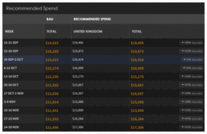
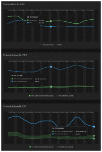
The Spend Advice page provides a recommended spend table, a graphic display of budget distributed by region, a graphic display of the network share of total budget as well as the predicted outcomes if the recommended spend is followed.
The Recommended Spend table is divided into two sections the Business as Usual (BAU) and Recommended Spend. The BAU columns display the total spend broken down by week. The Recommended Spend section provides the region, the recommended total spend and the percentage of change from BAU.
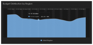
The Budget Distribution by Region is an interactive graph that displays the percentage of the budgeted spend by region broken down by the selected cadence and date range. Hovering over the graph will display the corresponding data.
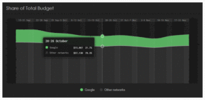
The Share of Total Budget graph shows how much of the total budget is allocated to the selected network, with an interactive view for easier analysis. The graph displays dates based upon the selected cadence and date range.
The Predicted Outcome interactive charts display a variety of metrics. Using the page settings tool you can select to display the metrics that are most valuable to you. Hovering over any of the charts will display the corresponding data.
Publisher:
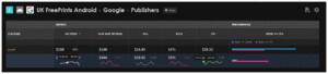
The Publisher table provides a single location to view the metrics and performance for the selected publisher.
The Publisher table is divided into two sections metrics and performance. The metrics section can display up to ten columns of metrics and the performance section displays spend against a selected metric (i.e., Spend vs Cost per Install).
Hovering over any of the metric line graphs will display the associated data.
Metric Options:
- As Spend
- Paid 365 Day Revenue
- Cost per Acquisition 7D
- Cost per Install
- Installs
- First Time Conversions 7 Day
- 365 Day Revenue
- 7 Day Registrations
- Total Cost Per Acquisition
- Total Return on Ad Spend (365D)
- Break Even
- Payment 7 Day
- Revenue 7 Day
- Paid Registrations
- Paid Installs
- Paid First Time Conversions 7 Day
- Organic Registrations
- Organic First Time Conversions 7 Day
- Paid Revenue 7 Day
- Organic Revenue 7 Day
- Total Cost per Install
- Organic Revenue 365 Day
- Install to FTC Conversion Rate
- Revenue Activity
- Paid Revenue Activity
- Organic Revenue Activity
- First Time Conversion Activity
- Paid First Time Conversion Activity
- Payments Activity
- Registration Activity
- Paid Payments Activity
- Paid Registration Activity
- Organic Payment Activity
- Organic Registration Activity
Compare Spend vs Options:
- Paid 365 Day Revenue
- Cost per Acquisition 7D
- Paid Return on Ad Spend (365D)
- Cost per Install
- Installs
- First Time Conversions 7 Day
- 365 Day Revenue
- 7 Day Registrations
- Total Cost Per Acquisition 7D
- Break Even
- Payments 7 Day
- Revenue 7 Day
- Paid Registrations
- Paid Installs
- Paid First Time Conversions 7 Day
- Paid Revenue 7 Day
- Rapid Revenue Activity
- Paid Payments Activity
- Paid Registration Activity
The data from the Publisher table can be downloaded by clicking on the CSV icon.

Campaigns:
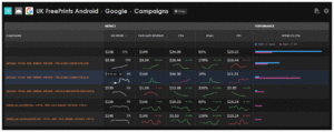
The Campaigns table provides a single location to view the metrics and performance associated with the campaigns run with the selected source.
Hovering over any of the metric line graphs will display the corresponding data, and displayed metrics and performance can be updated by accessing the page settings.
Metric Options:
- As Spend
- Paid 365 Day Revenue
- Cost per Acquisition 7D
- Cost per Install
- Installs
- First Time Conversions 7 Day
- 365 Day Revenue
- 7 Day Registrations
- Total Cost Per Acquisition
- Total Return on Ad Spend (365D)
- Break Even
- Payment 7 Day
- Revenue 7 Day
- Paid Registrations
- Paid Installs
- Paid First Time Conversions 7 Day
- Organic Registrations
- Organic First Time Conversions 7 Day
- Paid Revenue 7 Day
- Organic Revenue 7 Day
- Total Cost per Install
- Organic Revenue 365 Day
- Install to FTC Conversion Rate
- Revenue Activity
- Paid Revenue Activity
- Organic Revenue Activity
- First Time Conversion Activity
- Paid First Time Conversion Activity
- Payments Activity
- Registration Activity
- Paid Payments Activity
- Paid Registration Activity
- Organic Payment Activity
- Organic Registration Activity
Compare Share of Spend with Options:
- Paid 365 Day Revenue
- Cost per Acquisition 7D
- Paid Return on Ad Spend (365D)
- Cost per Install
- Installs
- First Time Conversions 7 Day
- 365 Day Revenue
- 7 Day Registrations
- Total Cost Per Acquisition 7D
- Break Even
- Payments 7 Day
- Revenue 7 Day
- Paid Registrations
- Paid Installs
- Paid First Time Conversions 7 Day
- Paid Revenue 7 Day
- Rapid Revenue Activity
- Paid Payments Activity
- Paid Registration Activity
Clicking on a campaign will navigate you to the specific campaign Recent Trends and Raw Data pages.
The Recent Trends page page provides insights into recent spend and how that spend has influenced acquisition, conversions and installs. The page is divided into three sections the Top-line Metrics, Headline Metrics and Chart Metrics.
The Top-Line Metrics section provides the ability to view two metrics which will display the current value as well as the trend based on the selected cadence and date range. Hovering over the line chart will display the associated data.
The Headline Metrics section provides the ability to select three metrics to display. Each metric that is displayed as a headline will show the metric title, the current (spend or metric percentage), the trend and a gauge illustrating the target and where the current standing is compared to that target.
The Chart Metrics section provides the ability to select as many metrics to display in an interactive chart form as needed. Each chart displays the selected cadence and date range. Hovering over any part of the chart will display the associated data.
The Campaign Raw Data table provides the ability to examine your data in row level form. Using the page settings tool allows you to determine which columns are displayed.